The design work for a magazine entails a process of permanent change which must remain true to some constant features with which readers identify it, while proving capable of surprising with each new issue.
TEXT MARÍA RUBIO | MOONBOOK
The evolution of the magazine The World of Mapfre has marched hand in hand with the technological changes in its production process. From working with galley proofs and photo offsets to the present when, thanks to desktop publishing, the Internet and digital files, the design, layout and printing work is much more streamlined and immediate. The design changes over its 25-year history make for interesting reading. Six stages are plainly evident.
The first one consists of issue numbers 1 to 38 (1993-2002), with the masthead Mapfre World and a 210 X 287 mm format. With a balanced use of serif and sans serif typefaces, small format images, gloss coated paper, stapled binding and without extra finishes, issue number one was published in January 1993. The lengthy texts were frequently backed up with data displayed in tables and colored boxes. The three-column grid was used throughout the publication.
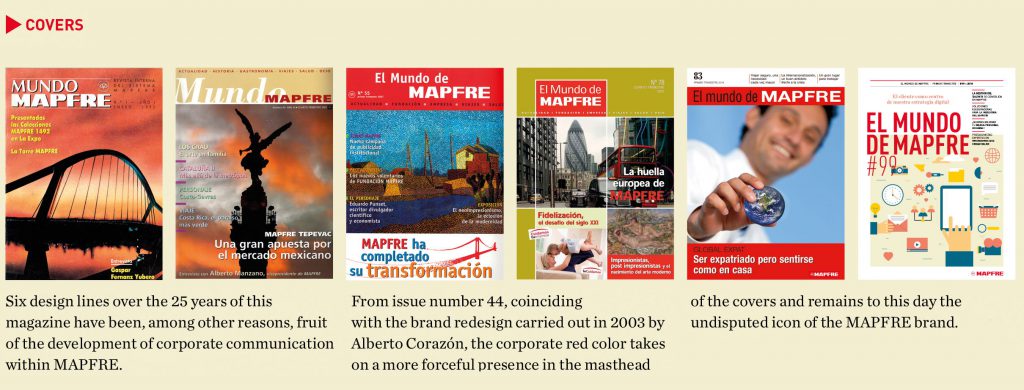
The second – very brief – stage comprises numbers 39 to 43 (2003-2004). Its format is one centimeter wider and the layout underwent a profound design transformation. Starting with the composition of the masthead, the typographic choice (more modern, with greater use of sans serif typefaces), larger images, typographic effects combining letter sizes in the headlines, more streamlined working grid, laminated finish…
A profound change that was consolidated in a third stage, numbers 44 to 55, (2004-2007), when the magazine was renamed The World of MAPFRE. Maintaining the format, the introduction of the corporate red color to the masthead was to become a permanent feature on the magazine covers from that time on. The interior layout employed a range of pastel colors to identify the various different sections. There was a firm commitment to the use of sans serif typefaces and the grid maintained a lively look with the use of texts and images. We can see an incipient use of illustrations in some of the sections.
In the fourth stage, covering numbers 59 to 82 (2008-2013), the format is proportionally enlarged in both width and height. The cover resembles more those of non-corporate news magazines, with boxes that always respect the red masthead, yet turn to alternate colors for each issue. Not so in the interior, where the sections lose their color identification and are now uniformly displayed in gray and corporate red. There is a return to the use of a serif typeface, although severely restricted to the headlines, intros and sidebars.
For numbers 83 to 94 (2014-2016), the change to both the masthead and the interior is once again evident. The format moves to 210 X 275 mm, the covers take on a more corporate aspect, the structure is simplified in favor of greater legibility and the power of the photographic image is accentuated. The interior grid is freer and the power of data as a visual icon with great communicative power can be discerned. Stand-out boxes supported by more visually impactful graphics are much more frequent. We finally have a magazine with a spine and glossy finish.
When the new design of The World of Mapfre was being considered for number 95, from Moonbook our aim was to make a clear break with earlier stages, while continuing to portray the easily identifiable corporate image of MAPFRE.
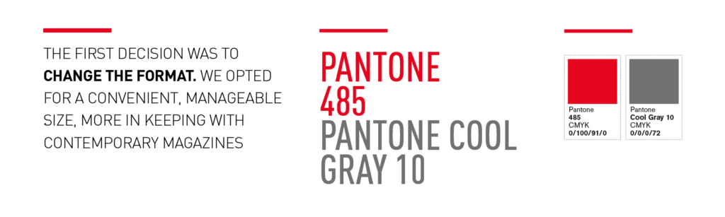
The first decision was to change the format. We opted for a convenient, manageable size (190 X 255 mm), more in keeping with contemporary magazines, and one of the main innovations was to do away with the cover photo and go for illustrations. In this way we managed to distance ourselves from more commercial magazines, keeping the chromatic force of the corporate red masthead and rearranging the information like in specialist journals.
This decision was likewise applied to the interior, where photographs and illustrations coexist in a measured balance with typographic effects and a clean, orderly layout. Simplifying the visual language, updating it and composing really elementary, yet highly impactful images with the help of icons with basic lines that are closer to the digital world.
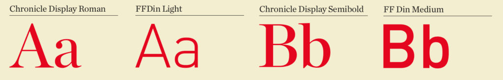
The structure of each article is clearly differentiated with the body copy and several additional texts that complement or highlight the information, as required in each case. DIN typography contributes greatly when it comes to highlighting data, offering small information pills that attract the reader and allow for a second reading of each text.
We are committed to a very measured use of the corporate colors: red, gray, black, white… pure, emphatic colors, supported by more nuanced color ranges used in backgrounds, icons or illustrations. Depending on the type of information, continuity in each issue is accomplished by unifying criteria and grid, typographic, iconographic and chromatic styles… all conveniently prioritized and identified in each section thanks to the balance of these parameters.
Another challenge is posed by the dual format – print and digital. Using icons supported with brief messages, or even QR codes, the relationship between the two versions is made more evident using some simple, quick resources that connect the reader to the digital version. This is further extended with document downloads, video viewings, audio and many other resources offered by the Internet and which are not available in print media. The graphical relationship between both versions focuses mainly on the use of color and the corporate typeface, with the online version maintaining the clarity of display of the news items already present in the printed version of The World of Mapfre.
We trust that the efforts of the whole team working on the magazine will help position The World of Mapfre as a reference point for corporate magazines worldwide, as a means of communication produced by and for everyone, with a variety of quality information synonymous with the values linked to the MAPFRE brand.